Designing a Power BI Sales Dashboard for Decision-Makers (AdventureWorks)
Designing a Power BI Sales Dashboard for Decision-Makers (AdventureWorks)
As a finance analyst, providing clear, relevant, and timely dashboards is critical for guiding decisions. Different stakeholders need different levels of insight:
- Analysts dig deep to find drivers and root causes.
- Managers want summaries that translate into action.
- Executives/board expect crisp KPIs and snapshots of performance.
My goal was to build a single Power BI report that satisfies all three without noise or overload.
🎯 Mindset & Framing
Before opening Power BI, I asked three questions.
1) What data am I working with?
This is backward-looking business data (classic BI, not forecasting) from the AdventureWorks dataset:
- Timeframe: ~3 years of transactions
- Facts:
Sales,Returns - Lookups:
Products,Categories,Subcategories,Customers,Territories,Calendar - Format: CSV exports (cleaned in Power Query as needed)
This naturally fits a star schema. (I’ll cover modeling and relationships in the next section—including a rolling Calendar table and why I hide foreign keys in fact tables.)
2) What am I trying to communicate?
I grouped possible visuals by the type of insight they convey:
Composition (over time / by category)
- Column/bar, clustered column/bar
- Line/area (time series)
- Tables / heat maps
- (Occasionally) radar, when categories are well-bounded
Parts of a whole
- Stacked bar/column
- Pie/donut (sparingly)
- Waterfall (gains/losses across drivers)
- Funnel (stages)
Distribution
- Histograms, box & whisker, scatter
- Heat maps
- Maps/choropleths (geospatial)
Relationships
- Scatter/bubble
- Correlation heat maps
This forces each visual to earn its place by answering a precise question.
3) Who is the end user?
- Analyst — granular, drill-through, detail tables for root cause.
- Manager — summaries with trend context; limited drill-down.
- Executive — KPI cards, simple charts, minimal friction.
I designed the report with progressive disclosure: KPIs → summaries → detail on demand.
With the audience defined and the insight categories mapped out, I moved on to designing the actual dashboard pages
📊 Dashboard Pages — From Raw Data to Executive Insights
Before we dive into the data modelling, ETL, and DAX magic, here’s the final product — a set of four interactive dashboards in Power BI that transform raw CSVs into decision-ready insights.
Each page answers a specific business question, with a consistent design, filtering, and navigation framework for a seamless user experience.
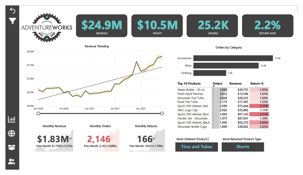
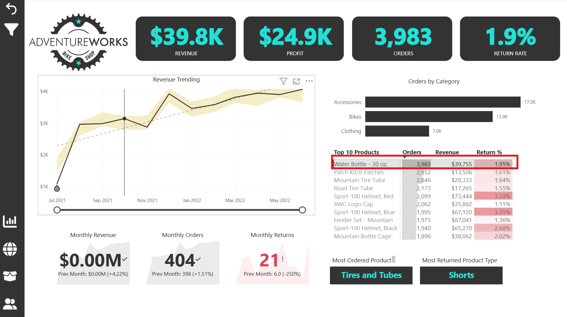
1️⃣ Executive Overview Dashboard
Purpose: Give executives an instant snapshot of company health and product performance.
Features:
- KPI Cards: Total Revenue, Total Profit, Total Orders, Return Rate.
- Revenue Trending: Line chart tracking revenue over time.
- Monthly KPIs: Cards for Monthly Revenue, Monthly Orders, Monthly Returns (with comparison to previous month).
- Orders by Category: Bar chart showing category-level performance.
- Top 10 Products: Matrix ranked by orders (descending) with Revenue and Return %.
- Product Highlights: Cards showing Most Ordered Product and Most Returned Product.
2️⃣ Orders by Geography
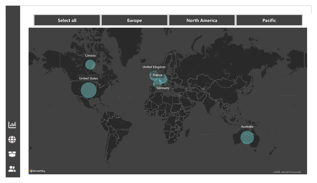
Purpose: Visualise geographic performance and allow regional drill-down.
Features:
- Map Visual: Total Orders by location.
- Continent Slicer: Enables filtering the map and related visuals by continent.
3️⃣ Product Detail Dashboard
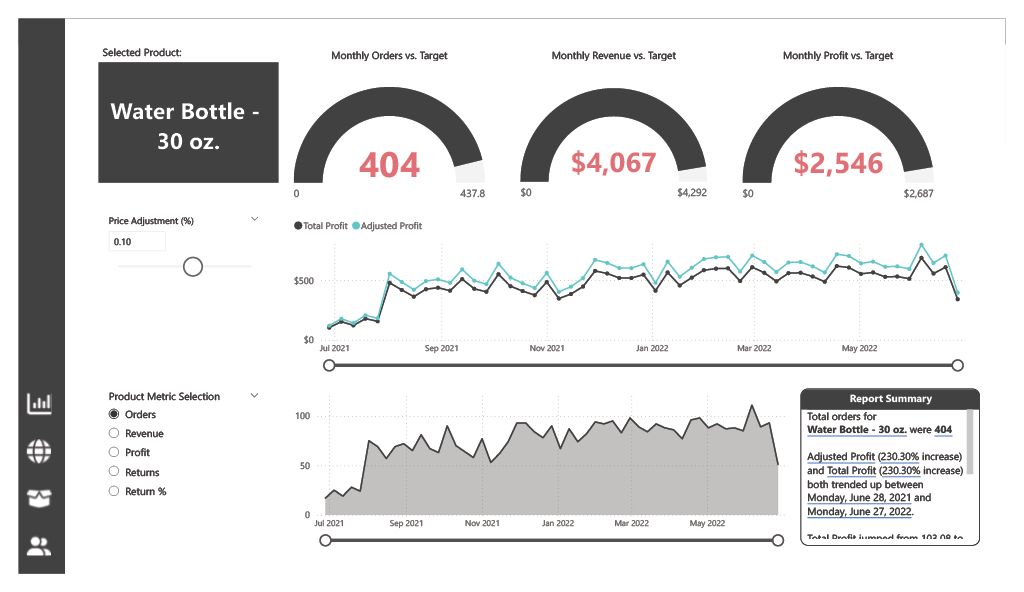
Purpose: Deep dive into a specific product’s performance against targets.
Features:
- Selected Product Card: Displays the name of the chosen product (e.g., Water Bottle – 30 oz).
- Performance Gauges: Monthly Orders vs Target, Monthly Revenue vs Target, Monthly Profit vs Target.
- Profit Trends: Line chart showing Total Profit and Adjusted Profit.
- Dynamic Metric Area Chart: Switch between Total Orders, Total Revenue, Total Profit, Total Returns, or Return Rate via a slicer from a Measures table.
- AI-Generated Summary: Power BI’s Smart Narrative visual generates an automated performance summary.
4️⃣ Customer Detail Dashboard
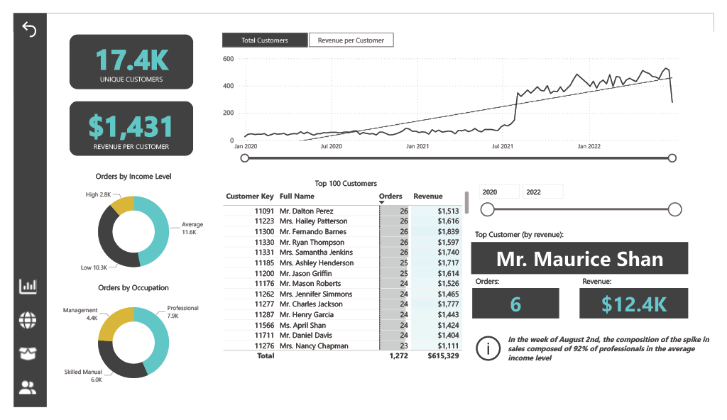
Purpose: Profile and analyse high-value customers.
Features:
- Customer KPIs: Unique Customers, Revenue per Customer.
- Demographic Donut Charts: Orders by Income Level, Orders by Occupation.
- Top Customers Matrix: Top 100 customers ranked by Orders (descending) with Customer Key, Full Name, Orders, and Revenue.
- Year Slicer: Filter the matrix by single year or range.
- Customer Spotlight: Cards showing Top Customer Name, Number of Orders, and Revenue.
💡 Beyond the visuals
This dashboard project showcases the complete Power BI development process — from sourcing and cleaning data, designing an efficient model, and creating reusable DAX measures with time intelligence, to integrating advanced features that enhance usability, storytelling, and security. These include:
- Bookmarks & navigation panes for guided storytelling.
- Data dictionaries for consistent field definitions.
- Interactive filtering, drilldowns, drill-throughs, and custom tooltips for deeper insights.
- Role-based security so each region only sees its own data.
We’ll explore these in detail in the Advanced Features section below.
🛠 Dashboard Design Framework

Now that you’ve seen the four final dashboards, here’s the design framework I used to ensure each page was both purposeful and actionable.
1) Define the Purpose
Each dashboard was designed to serve a specific decision-making purpose rather than act as a generic reporting tool. For example:
- Executive Overview: Sales and product performance tracking for leadership.
- Orders by Geography: Regional performance monitoring for sales managers.
- Product Detail: Individual product performance analysis against targets.
- Customer Detail: High-value customer profiling and segmentation.
This ensures each user group immediately sees the information that matters most to them without sifting through irrelevant data.
2) Choose the Right Metrics
Metrics were selected based on their relevance to the audience and their decision-making needs:
- Executive Overview: Revenue, Profit, Orders, Return Rate, Top Products.
- Orders by Geography: Total Orders, Continent-level performance.
- Product Detail: Monthly KPIs vs Targets, Profit Trends, Return Metrics.
- Customer Detail: Customer KPIs, Demographic Breakdowns, Top Customer Rankings.
Only metrics that directly answered a business question or supported a KPI were included.
3) Present the Data Effectively
Visualisations were chosen to maximise clarity and speed of insight:
- KPIs & Cards for instant snapshot values.
- Line Charts for trends over time.
- Bar & Column Charts for category comparisons.
- Maps for geographic insights.
The aim was to balance clarity with depth — giving the “big picture” without losing drill-down capability.
4) Eliminate Clutter & Noise
Only elements that served an analytical purpose made it onto the page. Removed were:
- Decorative visuals without insight.
- Overly complex chart types when simpler ones sufficed.
- Redundant data labels where tooltips worked better.
This kept dashboards clean, lightweight, and easy to scan.
5) Use Layout to Focus Attention
A top-left to bottom-right flow was used for visual hierarchy:
- Top-left: Core KPIs.
- Middle: Supporting trends and comparisons.
- Bottom/Right: Detail tables, drill-down visuals, or contextual breakdowns.
This guides the viewer naturally while reducing cognitive load.
6) Tell a Clear Story
Every dashboard follows the same storytelling arc:
- Where are we now? (Snapshot KPIs)
- How did we get here? (Trends & comparisons)
- What should we focus on next? (Highlights, exceptions, opportunities)
Clarity and actionability were prioritised over visual “flash” — so users walk away knowing exactly what to do next.
📦 Dataset & Modelling
The dashboards were built on the AdventureWorks dataset, provided in CSV format. This dataset contains a rich mix of transactional sales data, product details, customer information, and supporting lookup tables — ideal for demonstrating end-to-end modelling and reporting.
Source & Tables
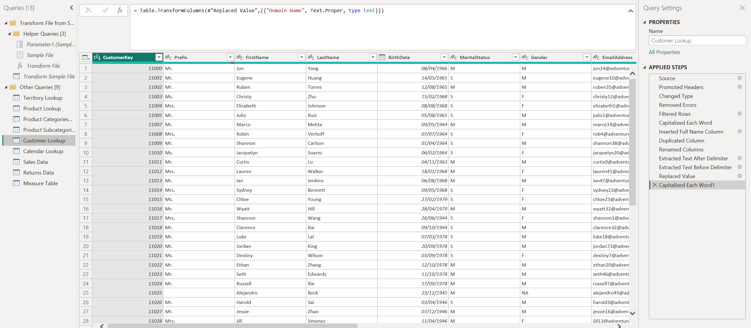
The core tables used included:
- Products, Categories, Subcategories – defining the product hierarchy.
- Calendar – a dedicated date dimension for time-based analysis.
- Customers – demographic and geographic details.
- Sales (Fact table) – transaction-level data for orders.
- Returns (Fact table) – records of product returns.
Modelling Approach
To ensure performance and ease of use, I designed the model as a star schema:
- Connected Primary Keys (PK) in lookup tables to Foreign Keys (FK) in fact tables.
- Hid all FK columns in the fact tables so end-users only see business-friendly fields.
- Established the correct filter direction to maintain clarity in relationships and avoid circular dependencies.
Why This Matters
A well-structured model makes everything else — from DAX calculations to visuals — simpler and more reliable.
By separating facts from dimensions, the dashboards load faster, relationships remain transparent, and users can navigate the data intuitively.
Data Model Screenshot:
📅 Calendar Lookup (Date Dimension)
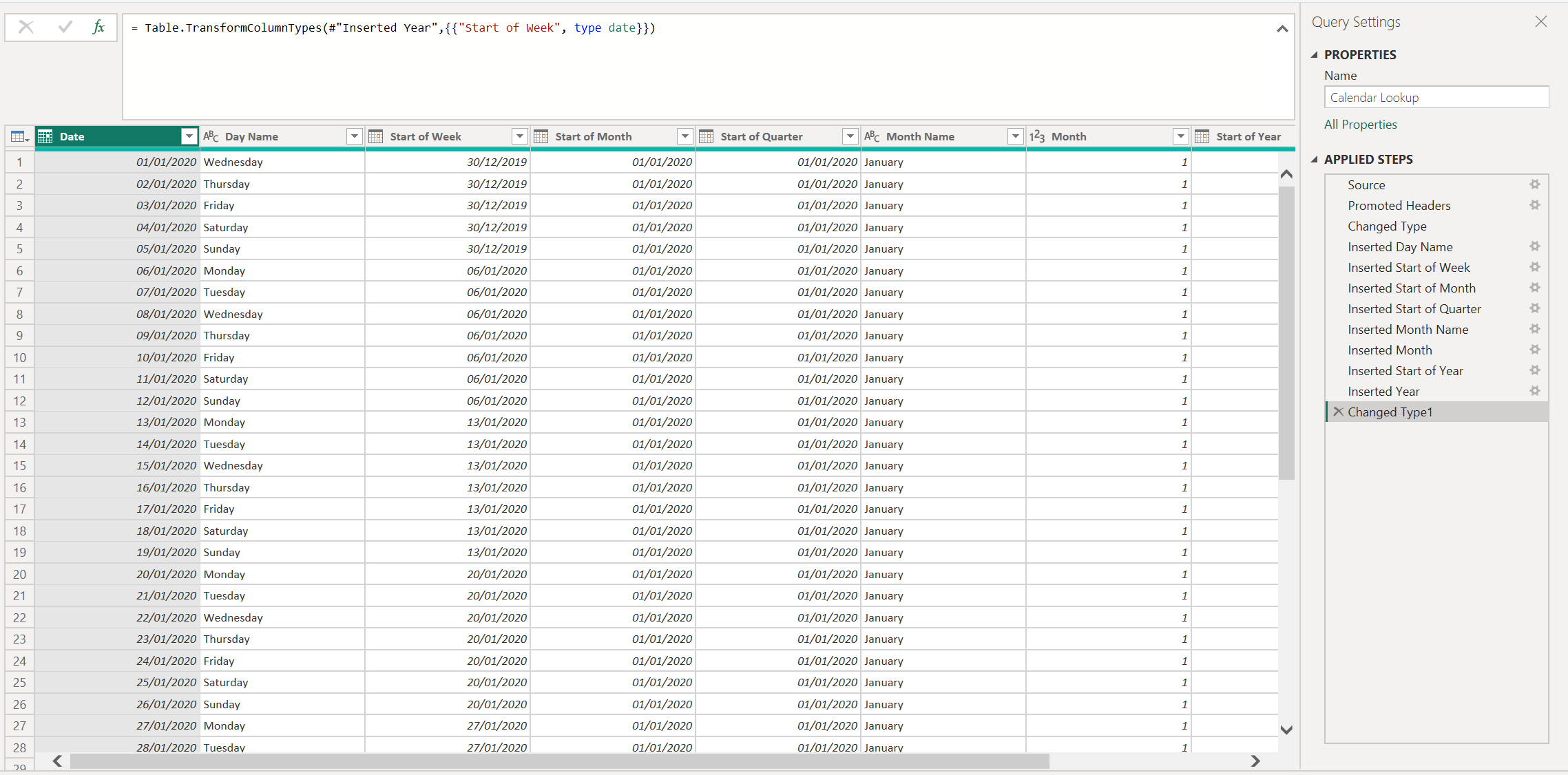
I built a dedicated Calendar Lookup table in Power Query and marked it as the model’s Date table.
This keeps time logic consistent and makes DAX time-intelligence simple and fast.
Why Power Query (not DAX) for the date table?
- Part of the ETL pipeline → reliable refresh, easy parameters.
- Keeps DAX for measures (YTD/MTD/L12M) rather than table creation.
- Avoids the unpredictability of
CALENDARAUTO()across multiple fact tables.
Rolling window
- Start: earliest transaction date (Sales/Returns) minus a small buffer.
- End: Today + a few months to handle forward-dated items without breaking visuals.
Columns I created (selected):
Day Name,Day of Week(1–7)Start of Week,Start of Month,Start of Quarter,Start of YearMonth Name,Month Short,Month Number (DAX)(for sorting)Month(1–12),YearWeekend(Weekday/Weekend flag)
Sorting rules: Month Name → sort by Month Number (DAX);
anyYearMonthLabel→ sort by a numericYearMonthNumber.
Relationships
Calendar Lookup[Date]→FactSales[OrderDate],FactReturns[ReturnDate](single direction: Calendar ➜ Facts).- All FK columns hidden in fact tables so users only see meaningful fields.
🔧 Light ETL (Power Query)
I kept the ETL simple and reliable in Power Query:
- Typed columns & cleaned text (trim, lowercase where needed)
- Built a star schema:
DimDate,DimProduct(with Category/Subcategory),DimCustomer - Kept facts lean:
FactSales,FactReturnswith numeric, date, and FK columns only - Hid FK columns in facts so users only see friendly fields
- Ensured single-direction filters (dimensions → facts) for clarity and performance
This keeps the model tidy and shifts business logic to DAX measures, where it belongs.
🚀 Advanced Features
These features go beyond the standard visuals, making the dashboards more dynamic, intuitive, and secure.
🔖 Bookmarks & Navigation Panes
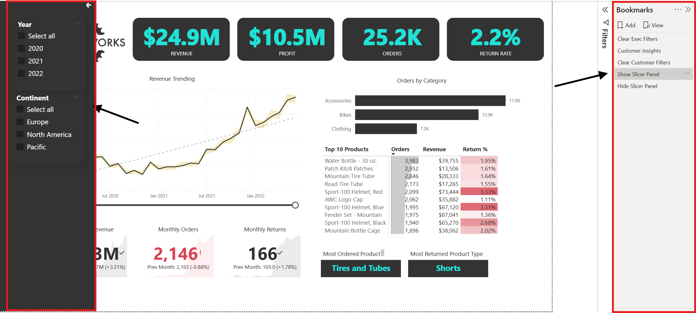
- Bookmarks capture the current state of visuals (filters, sort order, visibility) so you can create guided, story-like dashboard experiences.
- Navigation panes make it easy for users to jump between key insights without getting lost.
- In this project, bookmarks were used to toggle between overview pages and detail drilldowns for smoother navigation.
📚 Data Dictionary
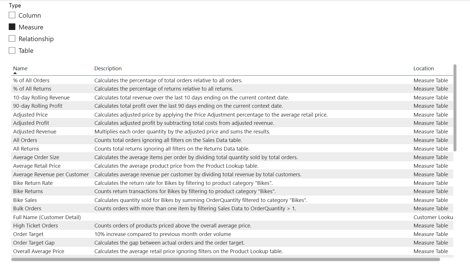
- Added a Data Dictionary page to document all key fields, measures, and KPIs.
- Each field definition is written in clear business language so both technical and non-technical users can interpret results correctly.
- Reduces confusion and supports self-service analytics.
🎯 Interactive Filtering & Drilldowns
- Clicking on elements (e.g., selecting "Water Bottle" in the Top Products matrix) updates all related visuals dynamically.
- Used Edit Interactions in Power BI to control which visuals respond to filters, avoiding irrelevant changes.
- This ensures users can focus on relevant metrics without unnecessary noise.
🌍 Role-Based Security (RLS)
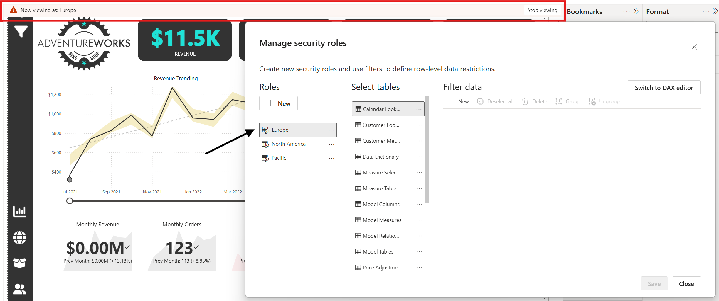
- Implemented Row-Level Security so each continent/region can only view their own sales and returns data.
- Example: Europe managers only see European data, while North America teams see theirs.
- Improves confidentiality and reduces accidental data exposure.
🗂 TMDL for Version Control
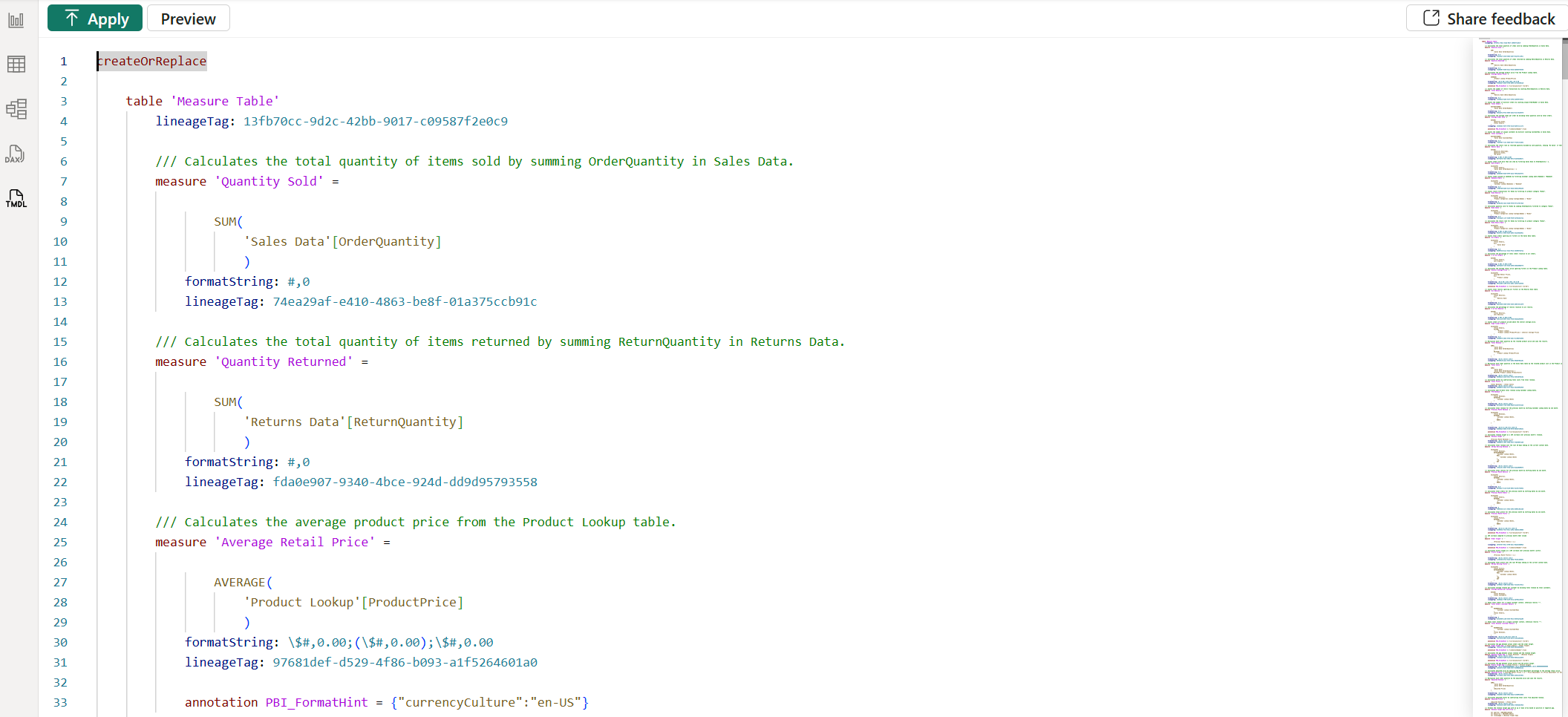
- Exported the semantic model in Tabular Model Definition Language (TMDL) for documentation and version control.
- Makes it easier to track changes to measures, relationships, and metadata over time.
🖱 Custom Tooltips
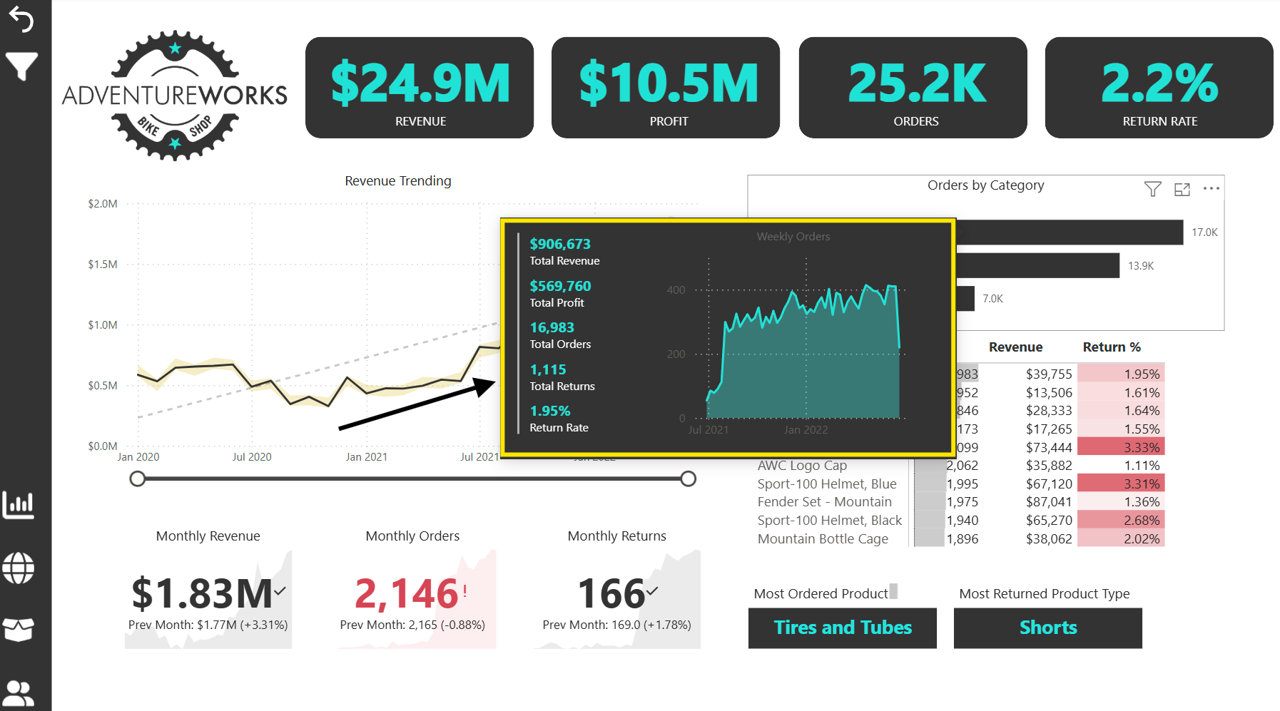
- Designed page-level tooltips to show extra context without crowding the main visuals.
- Examples in this project:
- Hovering over a KPI Card (e.g., Total Orders) reveals a breakdown by month or category.
- Hovering over a map location shows top products sold in that region.
- Benefits:
- Keeps dashboards visually clean while still offering depth.
- Allows “on-demand” insights for curious users without forcing drillthrough.
- Created tooltip pages using the Tooltip page size in Power BI, then linked them to visuals via the Tooltip property.
- Designed with a minimal colour scheme and consistent fonts so tooltips feel like a natural extension of the dashboard rather than pop-ups.
📝 Pro Tip: These advanced features not only improve user experience but also make your Power BI solution more maintainable and secure in the long run.
🛠 Common Issues & How I Overcame Them
Even with experience, building production-ready Power BI dashboards comes with its share of challenges.
Here are the most notable issues I encountered in this project — and the strategies I used to resolve them.
1️⃣ Messy, Inconsistent Source Data
Issue: The raw CSV files contained inconsistent date formats, null values, and mismatched product names.
Solution: Standardised all columns in Power Query during the ETL stage — applying consistent data types, fixing spelling variations, and creating lookup tables for category names.
2️⃣ Deciding Where to Apply Transformations — Power Query vs DAX vs Report Level
Issue: Unsure whether certain logic (e.g., calculated columns, grouping, filtering) should be handled in Power Query, DAX, or at the report layer.
Solution & Framework:
- Power Query: Structural changes, data type enforcement, merging, cleaning, filtering out irrelevant rows.
- DAX: Business logic, dynamic measures, time intelligence, and aggregations that must respond to slicers.
- Report Layer: Cosmetic changes, formatting, conditional formatting rules, tooltips.
Guiding Rule: If it doesn’t need to be dynamic, do it in Power Query. If it needs to respond to user interaction, do it in DAX.
3️⃣ Slow Performance on Large Data Sets
Issue: Initial load and refresh times were long due to large fact tables.
Solution:
- Reduced model size by removing unused columns.
- Aggregated data in Power Query before loading.
- Created summary tables for high-level dashboards.
4️⃣ Incorrect Time Intelligence Calculations
Issue: DAX measures using SAMEPERIODLASTYEAR and DATEADD returned unexpected results.
Solution: Created a proper Date table marked as a Date Table in Power BI, with continuous date ranges, and adjusted relationships to avoid gaps.
5️⃣ Cardinality & Ambiguous Relationships
Issue: Many-to-many relationships between fact tables caused ambiguity in filter flow and incorrect aggregations.
Solution:
- Introduced bridge tables to resolve many-to-many relationships.
- Adjusted model to star schema where possible.
- Used
CROSSFILTERin DAX only when absolutely necessary, and documented it clearly.
6️⃣ Unexpected Filter Flow & Context Issues
Issue: Measures returning inflated or incorrect numbers when slicers interacted unexpectedly.
Solution:
- Explicitly controlled filter propagation using
REMOVEFILTERS,ALL, andKEEPFILTERS. - Used the Performance Analyzer to see the exact query flow and optimise.
7️⃣ Overcrowded Visuals
Issue: Too many visuals on a page made it hard for users to focus.
Solution: Adopted a “less but better” approach — limited each page to visuals that directly answered a business question, and moved supporting visuals to tooltips or drill-through pages.
8️⃣ User Confusion with Filters
Issue: Users applied multiple slicers at once without realising the compounding effect.
Solution: Added clear filter indicators, redesigned slicers for better visibility, and provided a “Reset Filters” button using bookmarks.
9️⃣ Role-Based Security Testing
Issue: Certain users could see data for regions they weren’t supposed to access.
Solution: Configured Row-Level Security roles, tested each role in Power BI Desktop’s “View As” mode, and verified results with stakeholders.
💡 Each of these challenges forced me to refine my process — leading to cleaner data models, faster dashboards, and a more intuitive end-user experience.
💬 Got a data challenge you’ve been meaning to solve? I specialise in turning messy datasets into clear, decision-ready dashboards that help businesses act fast.
🚀 If you want to unlock insights, streamline reporting, and see your business from a new perspective, let’s talk. Whether it’s a one-off project or ongoing support, I can help you get there.
Let’s work together to make your data work for you.